I love color. Color
is considered a form of non verbal communication. There is a psychology of color which predicts
your personality based on the color you’re drawn to. Of course, the meaning of each color can vary
by culture. Color can even be powerful
enough to alter your current mood.
In quilting, we often refer to the color wheel to help find
complimentary and contrasting color. We
also very often talk about value, which refers to shades of color, and the
importance of having a balance of light, medium and dark.
Some colors have been grouped into “warm” and “cool” colors
and then there are the neutrals or the “weak” colors. And of course, each of these groups have
varying shades. The placement of color
and value can add dimension and movement to a project. The same project made in warm colors can look
completely different than one made in cool colors. Reversing the placement of lights and darks
can also create a totally different look.
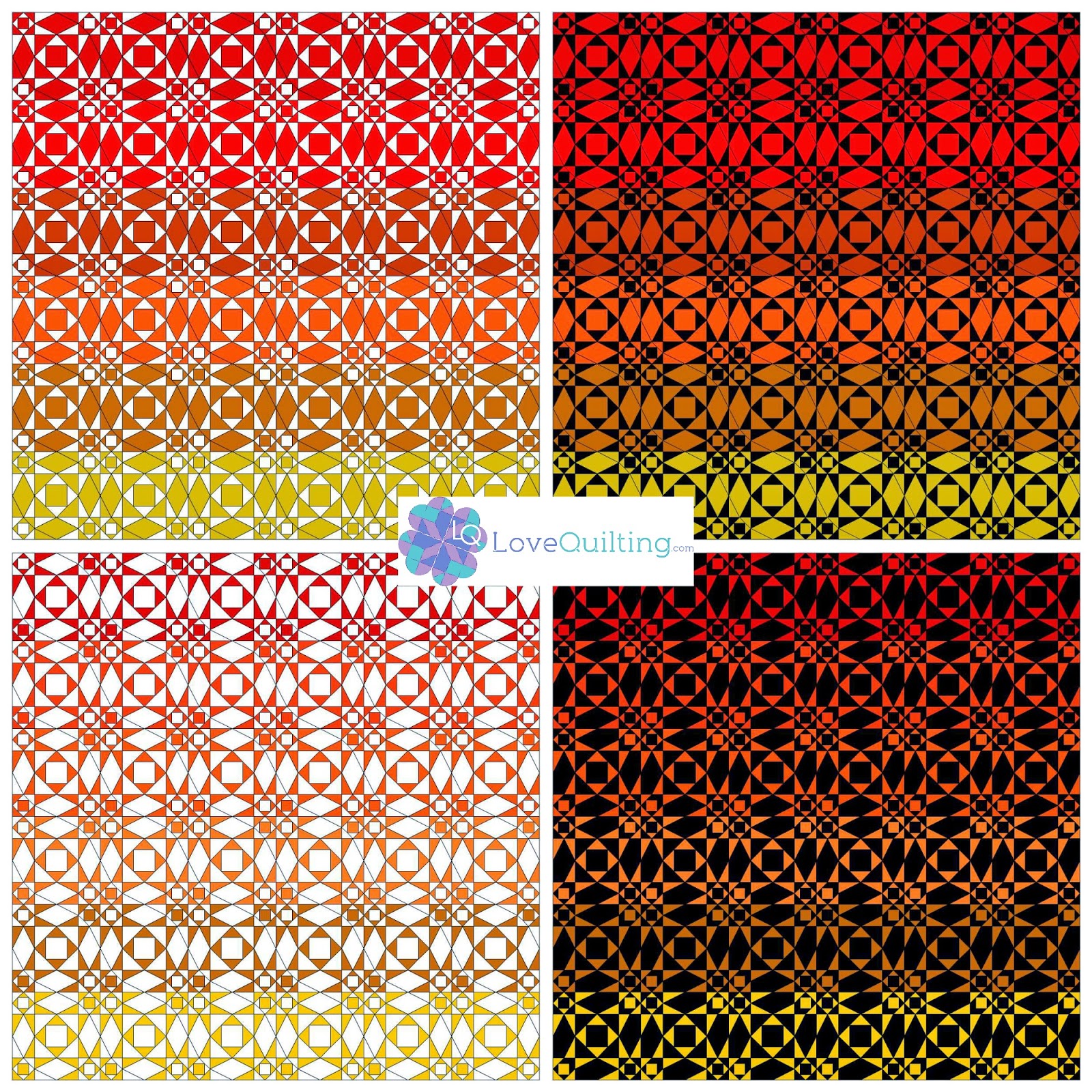
Using one of my very favorite blocks, below are some
examples of a 6 x 6 layout of Storm at Sea in warm and cool colors. The Storm at Sea block creates such exciting
movement. As you can see from these
examples, the use of various colors and the placement of lights and darks can
create completely different looks.
As we head into the second half of summer, which, where I
live, is always the hotter part of summer, I’m focusing on the warm colors –
red, orange and yellow and all the shades in between. All warm color fabrics are on sale this
week. Here are our top picks for “warm
color” projects.
#fabric #warmcolors #fabricsale #color #lovequilting
Do what you love - love what you do - Lovequilting.com!

.jpg)


No comments:
Post a Comment